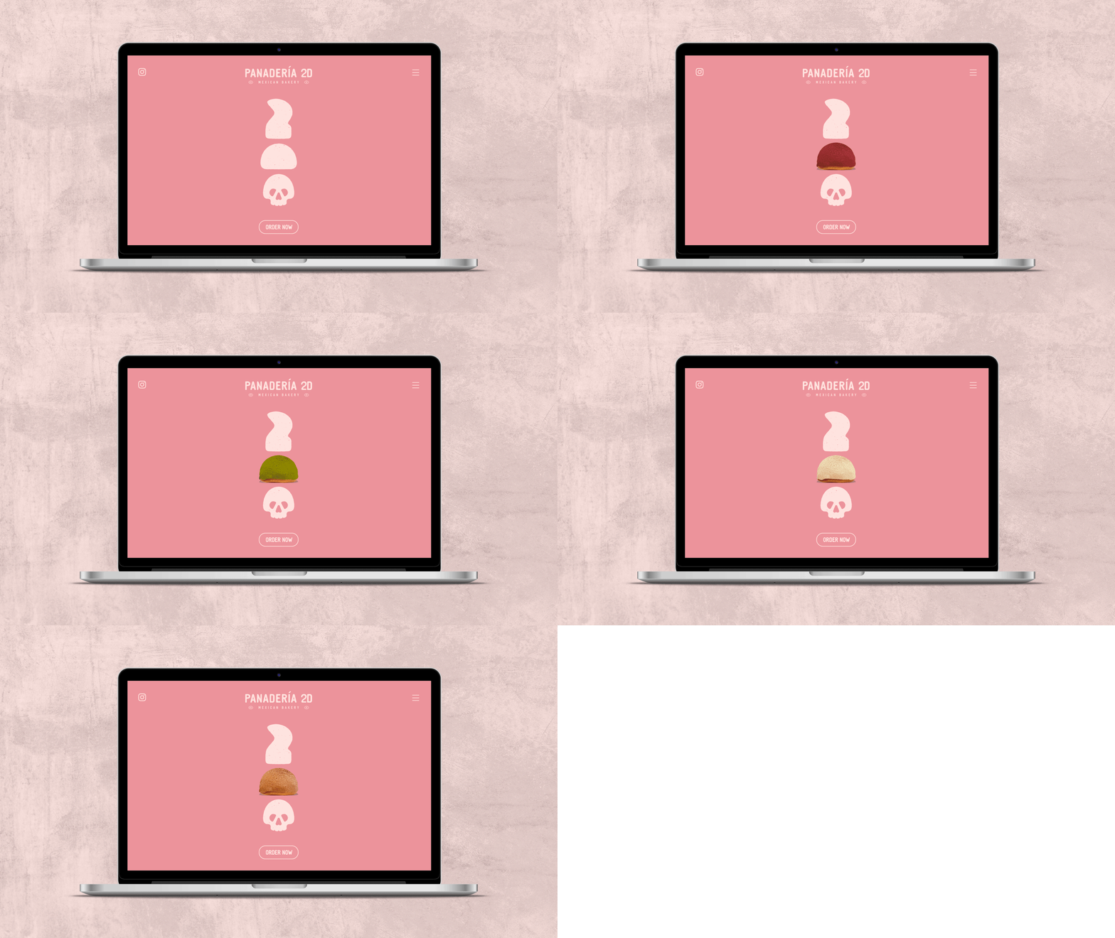
CASE STUDYPANADERÍA 2D
PROJECT: Panadería 2D
CLIENT: Panadería 2D
ROLE: Brand Strategy · Creative Direction · Brand Identity · Illustration · Art Direction
01 / OVERVIEW
Panadería 2D is a New York bakery specializing in Mexican pan dulce, mainly conchas and pan de muerto. The brief was pretty open: I was given the name, a preference for pink and skulls, and the freedom to take it from there.
I developed the brand from scratch, from the initial concept to the full visual identity. This included the logo, custom typography, type hierarchy, color palette, and a series of hand-drawn illustrations. I wanted to create something that felt Mexican, playful, and a little different from your typical bakery branding.
02 / THE CHALLENGE
The starting point was pretty simple: a name, pink, and skulls. From there, I had to figure out how to bring all these elements together into a brand that felt cohesive and had its own personality.
I wanted to avoid the usual look of a traditional Mexican bakery, I wanted it to feel modern while still keeping a strong connection to Mexican culture. The challenge was creating something that felt fresh and a little unexpected without losing that connection.
03 / THE STRATEGY
Before getting into the visuals, I wanted to understand what made Panadería 2D different and where it could fit in New York's bakery scene.
The idea was to create a bakery that brought Mexican pan dulce to a different audience, while keeping its connection to its roots. I looked at the local market, other bakeries, the brand's story, and the people it wanted to reach.
This helped define the direction: a bakery that felt Mexican, but not overly traditional; elevated, but still warm and approachable. That balance became the starting point for the creative direction.
BRAND RESEARCH: Looked into the bakery’s background and origin story.
MARKET RESEARCH: Researched New York’s bakery scene and identified relevant competitors.
COMPETITION ANALYSIS: Compared competing bakeries, their products, positioning, and price points.
SWOT ANALYSIS: Identified the brand’s strengths, weaknesses, opportunities, and threats.
POSITIONING: Defined the brand’s objective, mission, vision, and unique selling proposition.
VALUES: Established artisanship, cultural celebration, and excellence as its core values.
TARGET MARKET: Defined primary and secondary audiences and developed buyer personas.
03 / CREATIVE DIRECTION
The client came in with only two requests: pink and skulls. The bakery's main products were conchas and pan de muerto, so I wanted to find a way to bring those elements into the identity without making it feel too obvious or predictable.
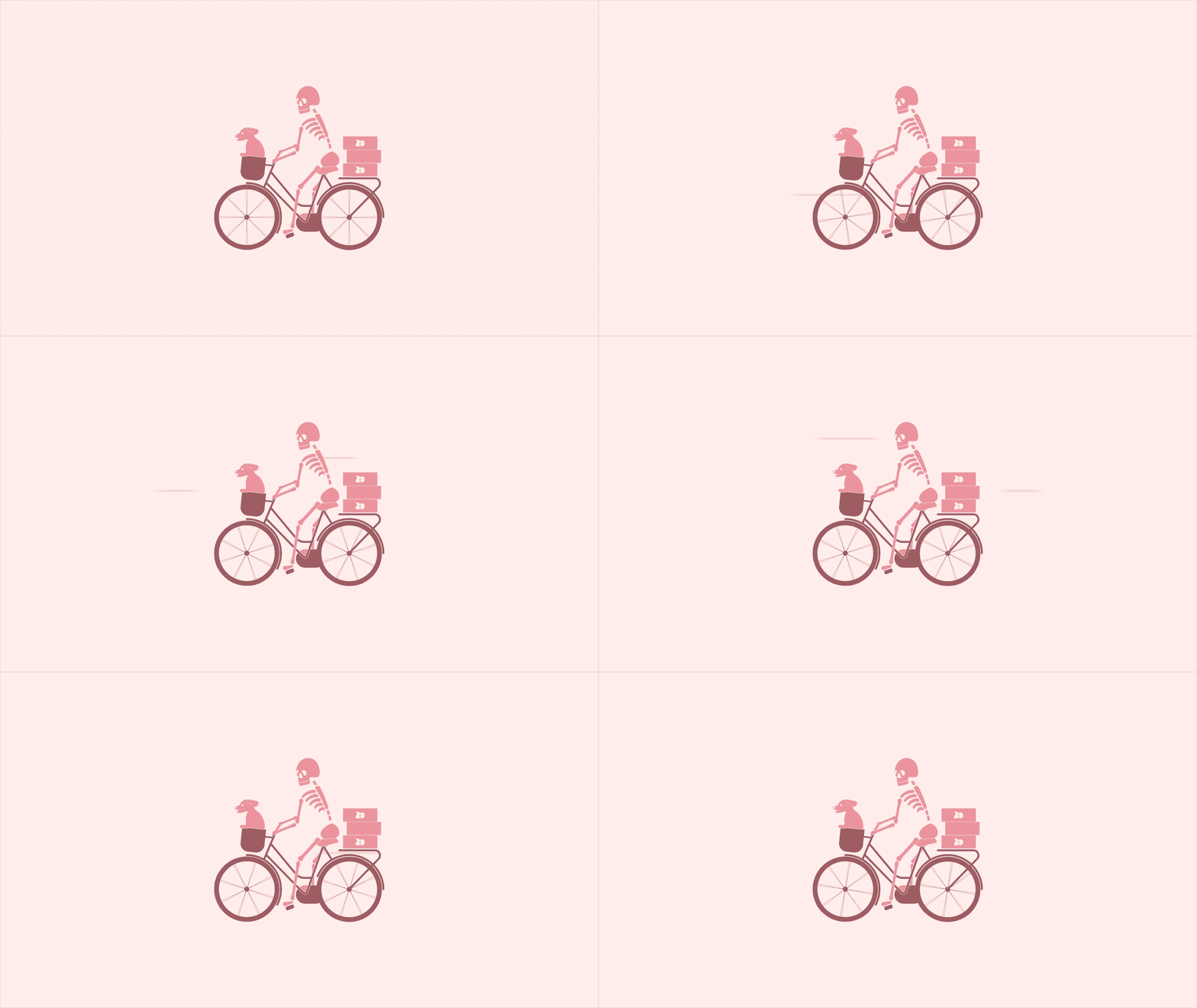
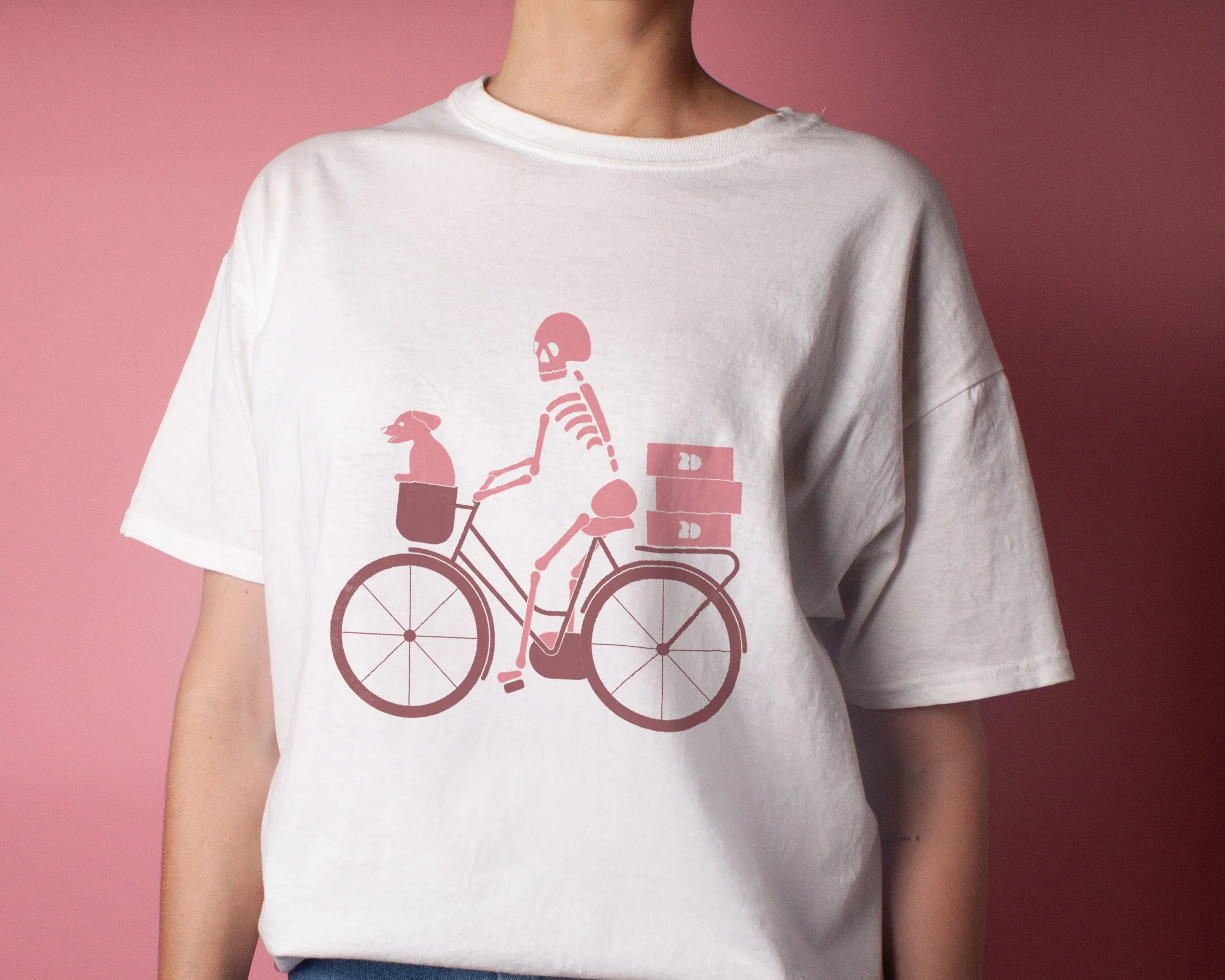
But there was more to the bakery's story. It started during the pandemic, when the owner began baking conchas in her apartment to bring a little sense of home to friends she couldn't see in person. She'd hop on her bike to deliver them, with her dog Cleo riding along in the basket. What started with a few deliveries eventually grew through word of mouth.
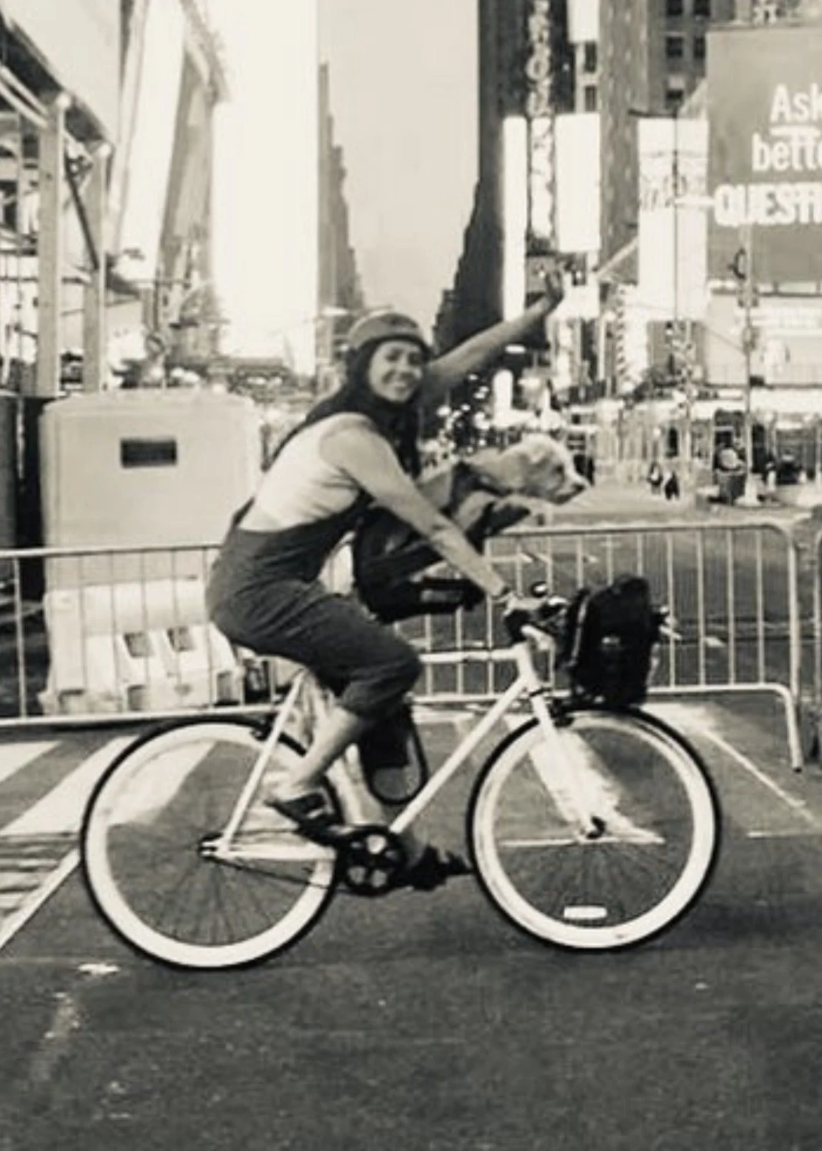
Once I had a better understanding of the bakery, I started looking for inspiration. I was in Mexico City at the time, so instead of scrolling through Pinterest, I went outside and started walking around the city.
That's when I came across a building with lettering that completely caught my eye. I took a photo, and it ended up becoming the starting point for developing a custom typeface for the brand.
04 / VISUAL IDENTITY
With the visual direction in place, I started building the identity. The custom typeface became the foundation for the logo, paired with a secondary font to create contrast and flexibility.
I also designed a friendly skull that brought the client's original request into the identity without making it feel spooky. From there, I developed different logo variations so the brand could work across different sizes and applications.
LOGO
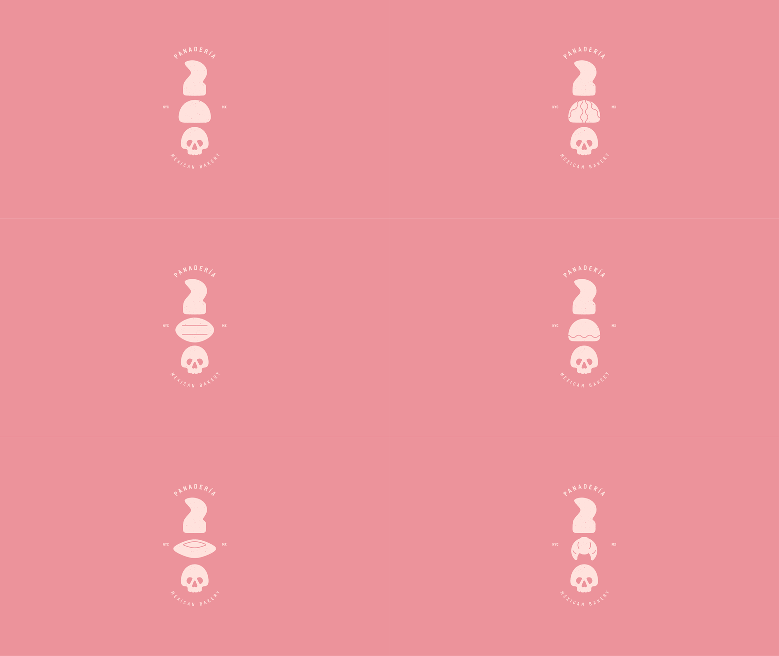
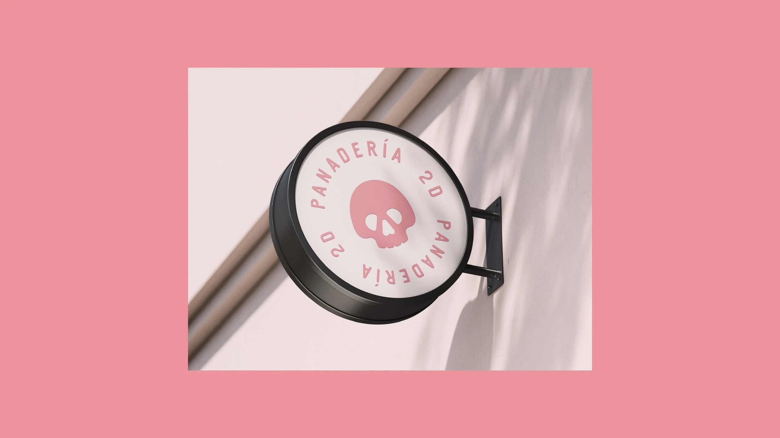
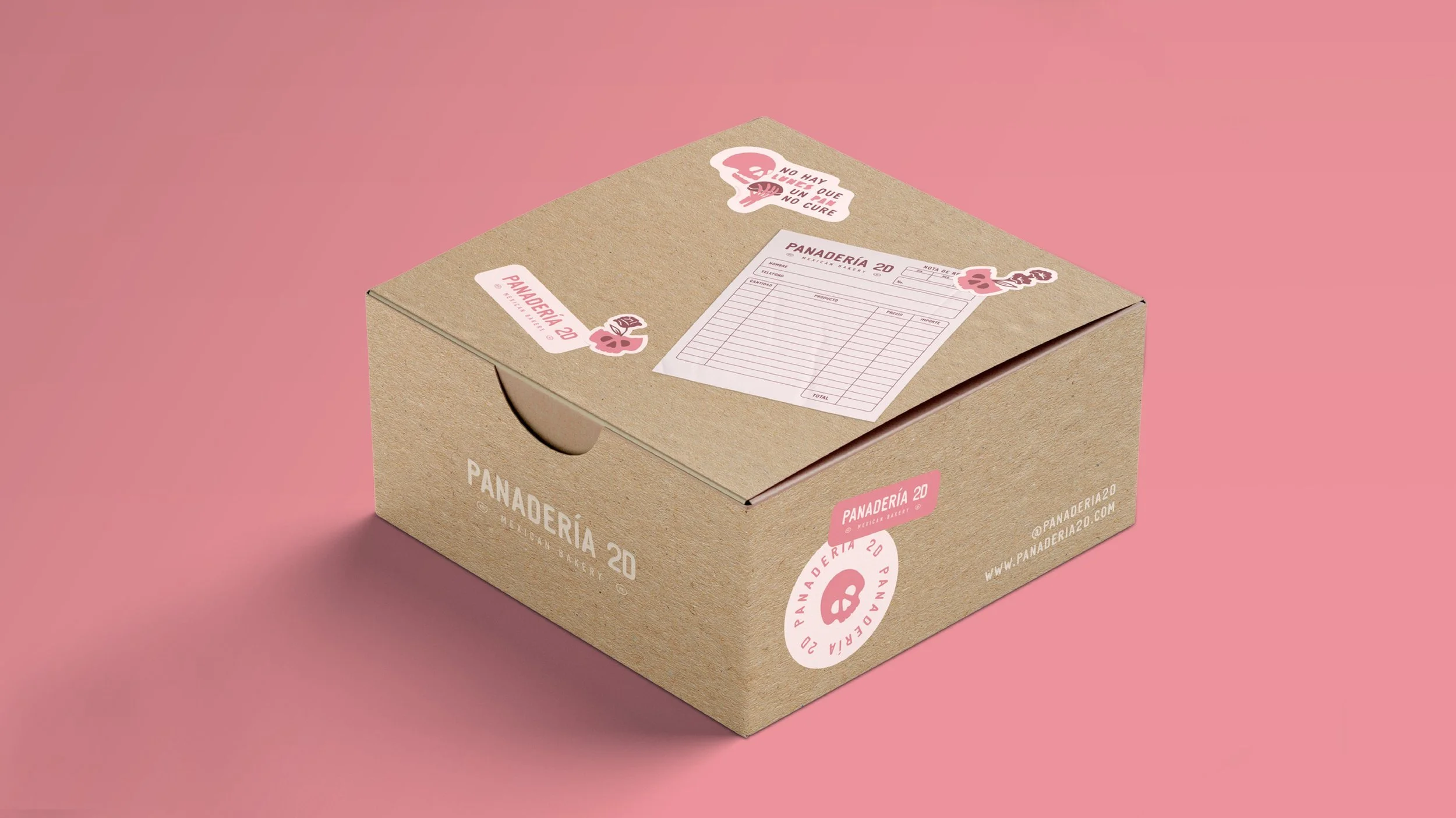
I didn't want the brand to rely on just one logo. It needed to work across a lot of different places: paper bags, boxes, signage, menus, merch, etc…
So instead of creating one primary logo with a few variations, I designed a whole family of logos. Each one could work in a different context, depending on the space or application, while still feeling like part of the same identity.
The idea was to give the bakery some flexibility without losing consistency.
TYPOGRAPHY
The custom typeface became the foundation of the brand. I paired it with a secondary font that I modified by softening its edges. Since it was a bakery, I wanted the typography to feel a little softer and fluffier, almost like the bread itself.
COLOR PALETTE
Pink was one of the client's original requests, so it was always going to be part of the identity. But I didn't want it to be the only color. I wanted to give it some balance and bring in colors that felt just as playful and warm.
I started collecting colors from photographs I took while walking around Mexico City, then experimented with different combinations until I found a palette that felt right for the brand.
ILLUSTRATION & ANIMATION
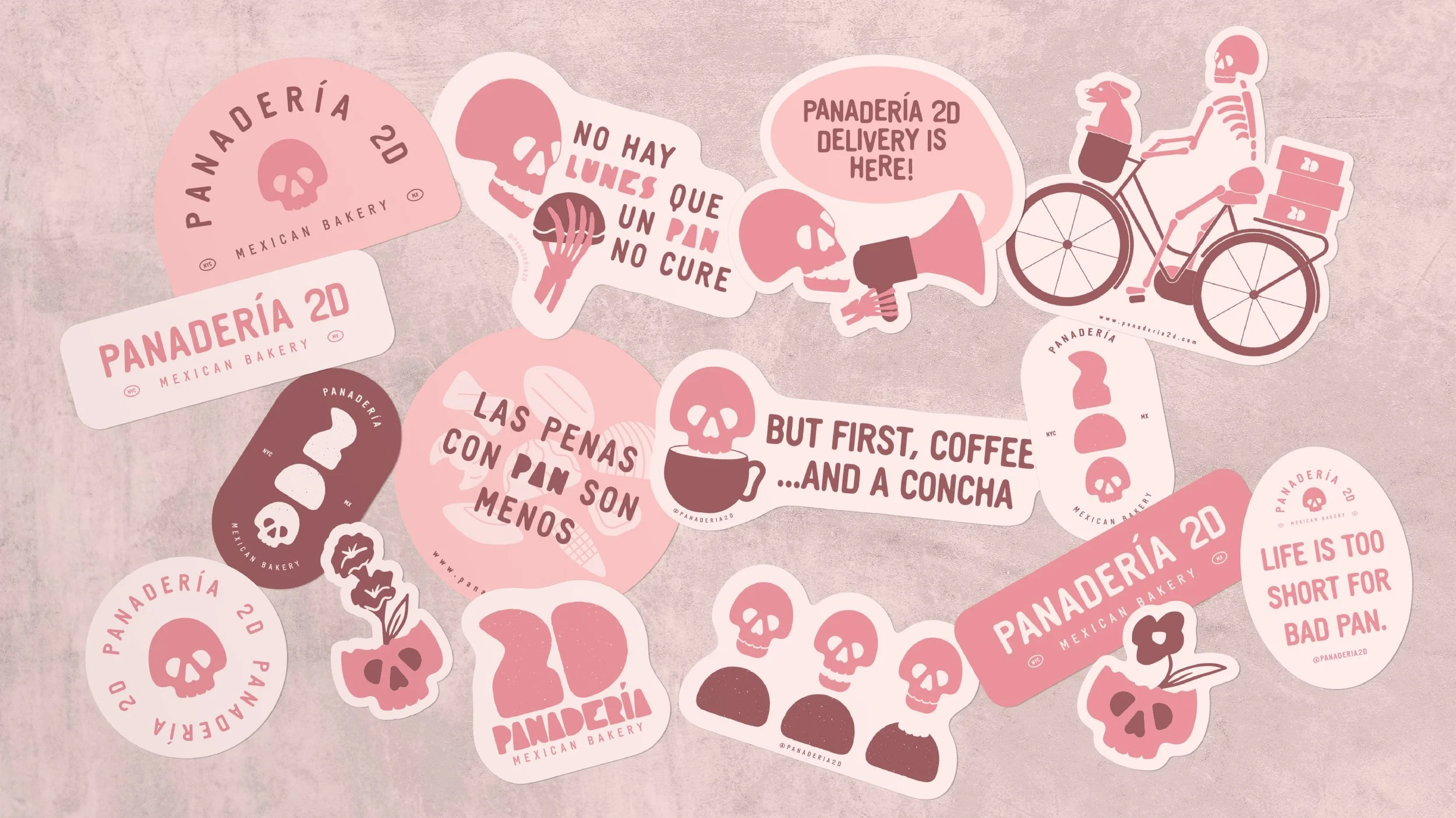
I wanted illustration to be a big part of the identity, giving the brand another way to express its personality.
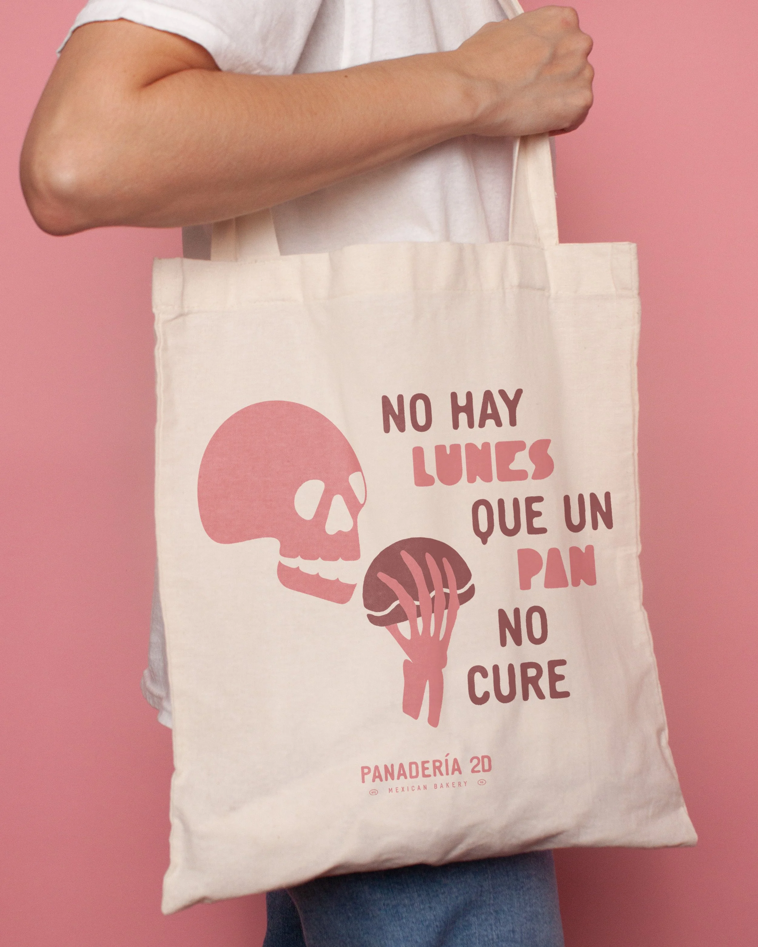
I built a small collection of illustrations around some of the bakery's key elements: the friendly skull, conchas, and Cleo, the dog who used to ride along in the basket during deliveries.
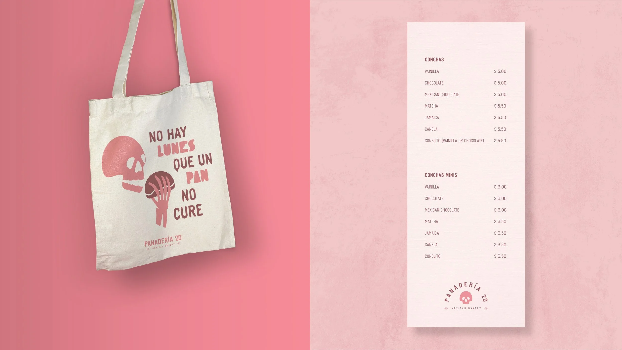
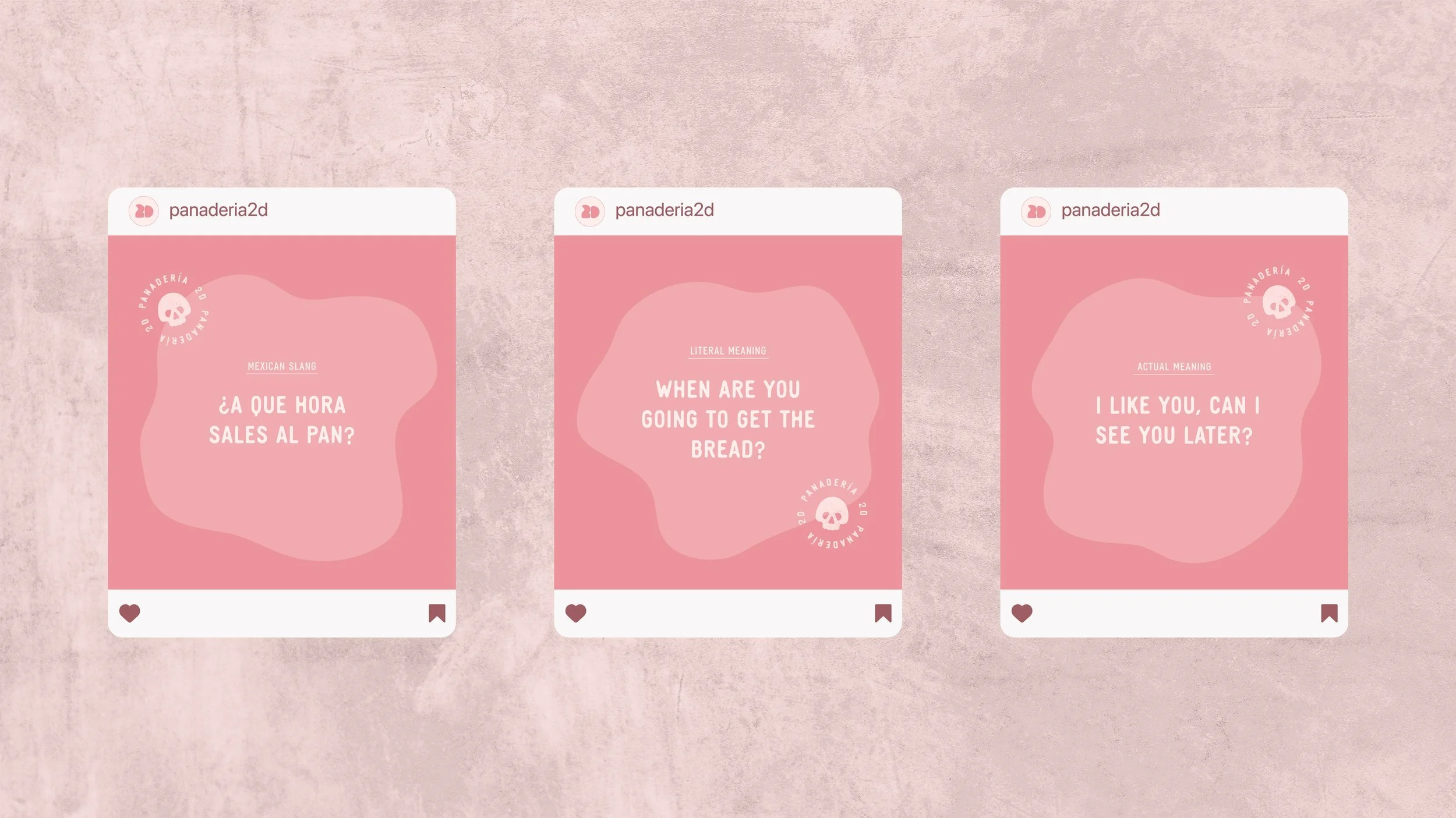
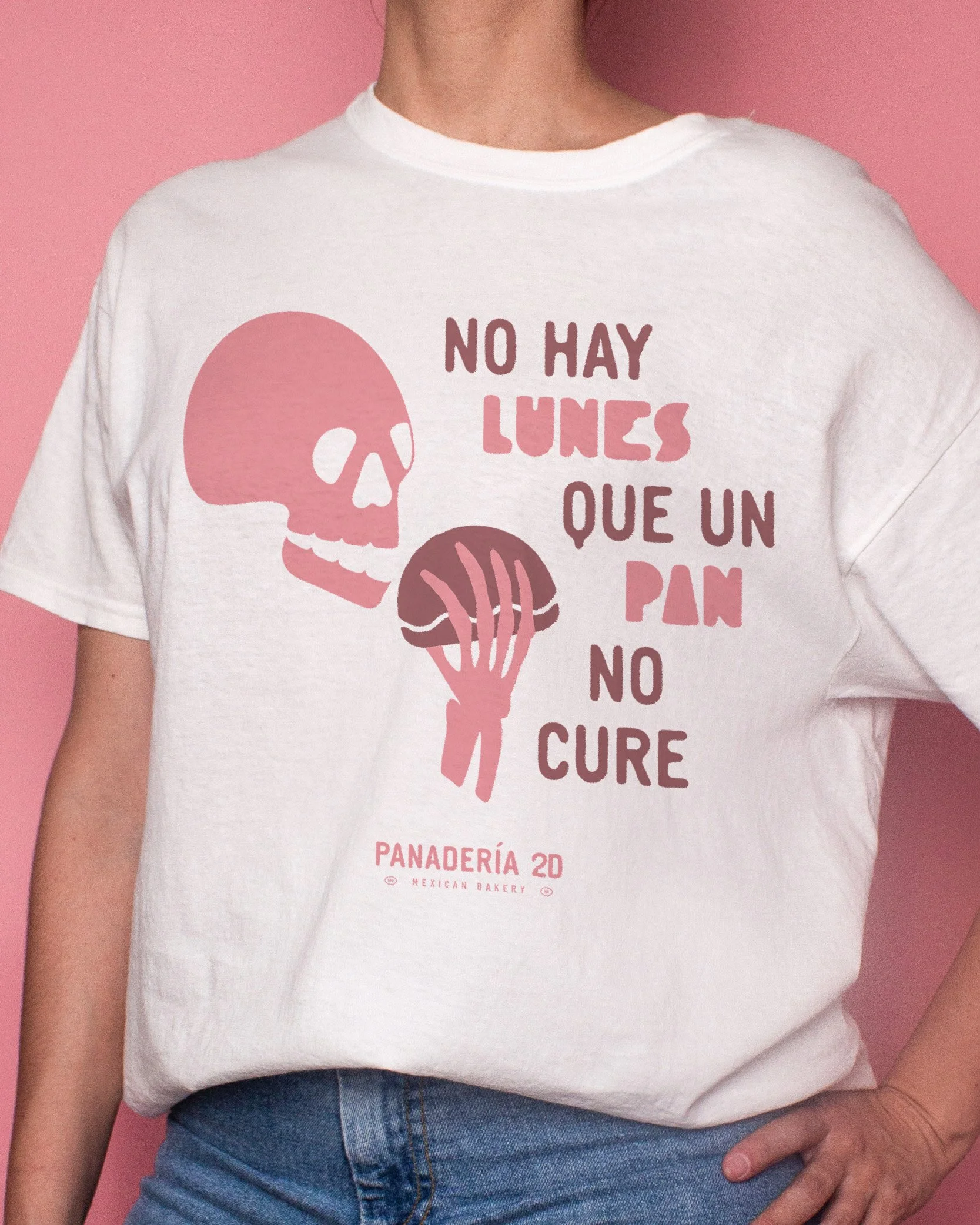
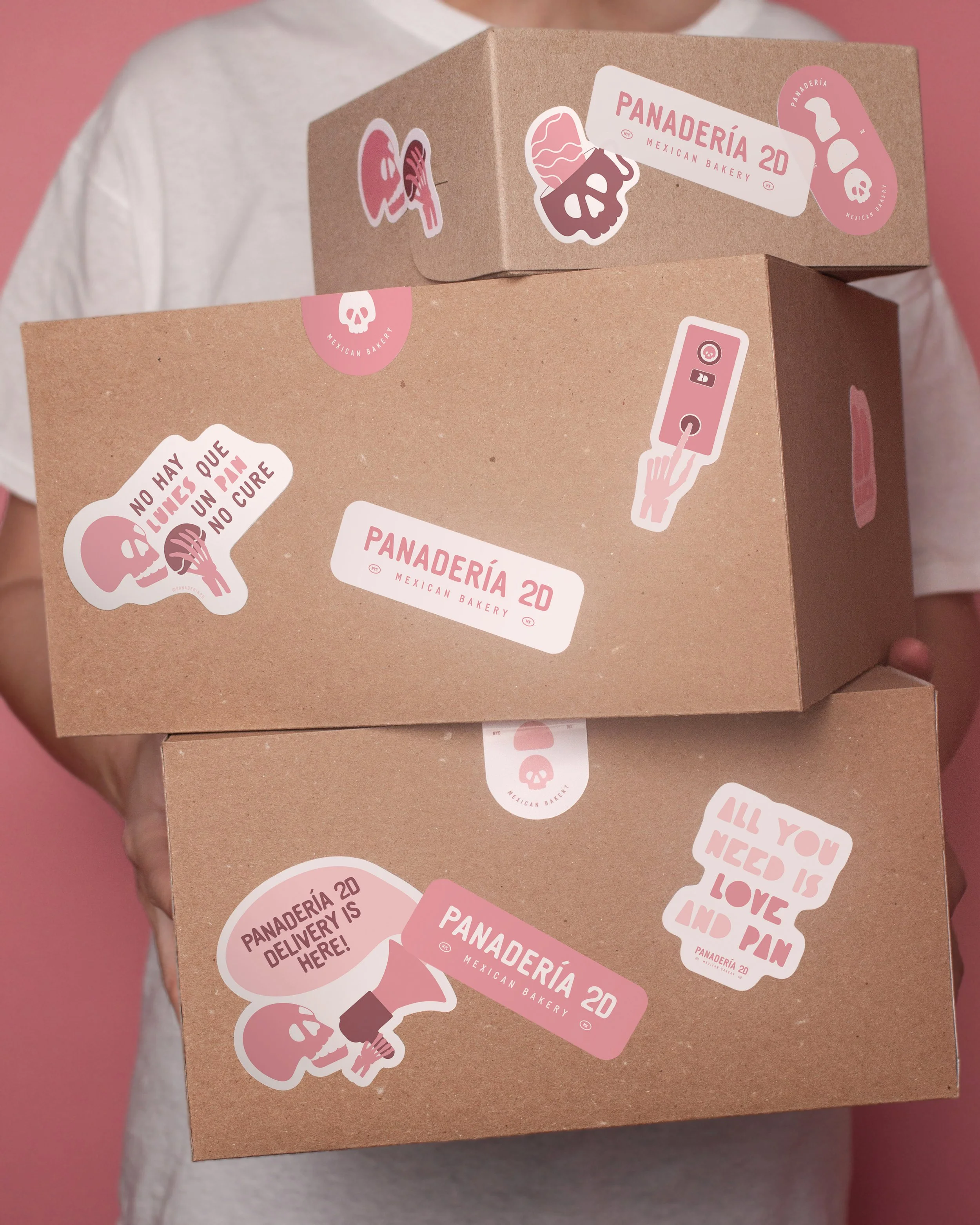
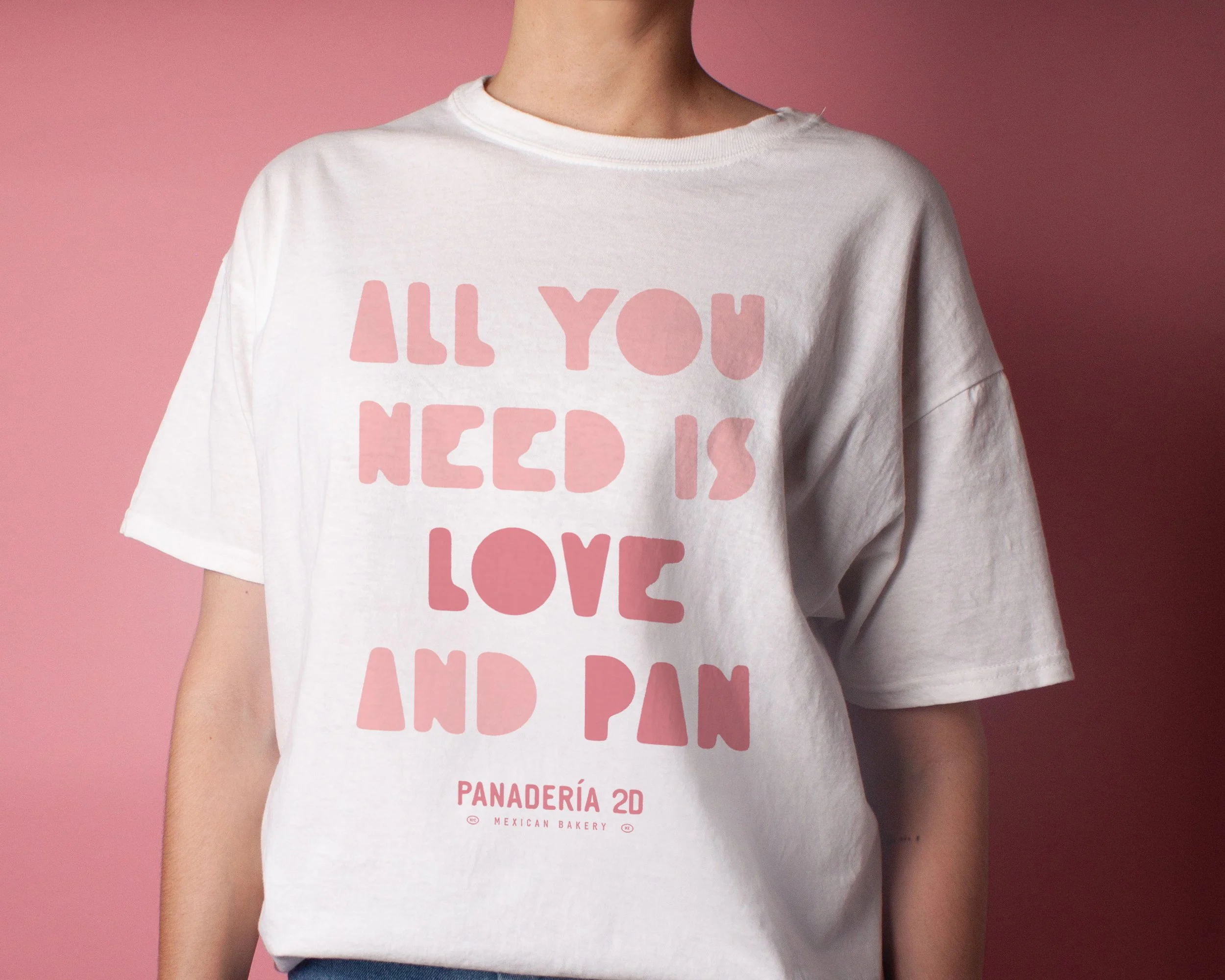
I also incorporated phrases from the brand's voice to give the illustrations even more personality and make the identity feel playful and full of character.
05 / ART DIRECTION
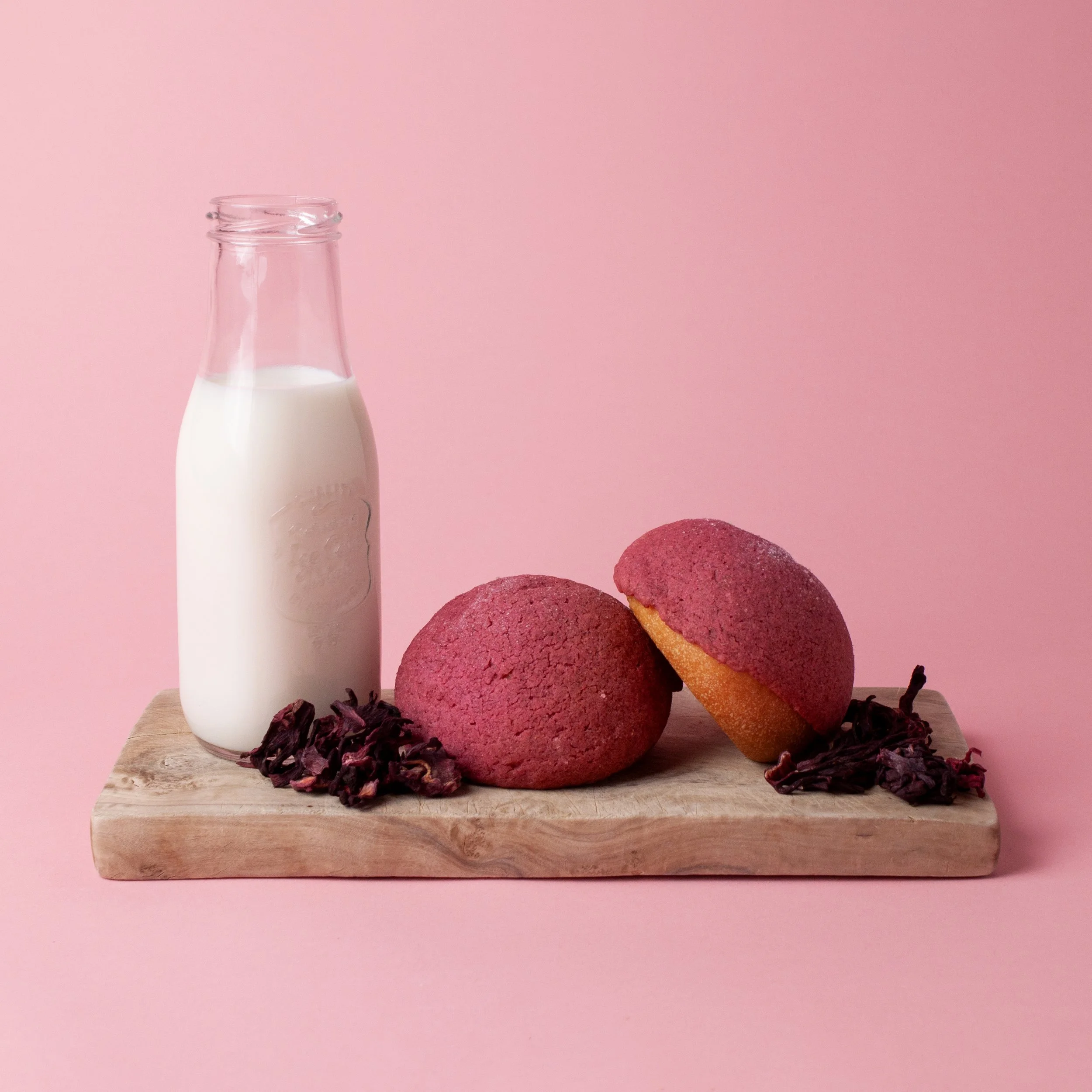
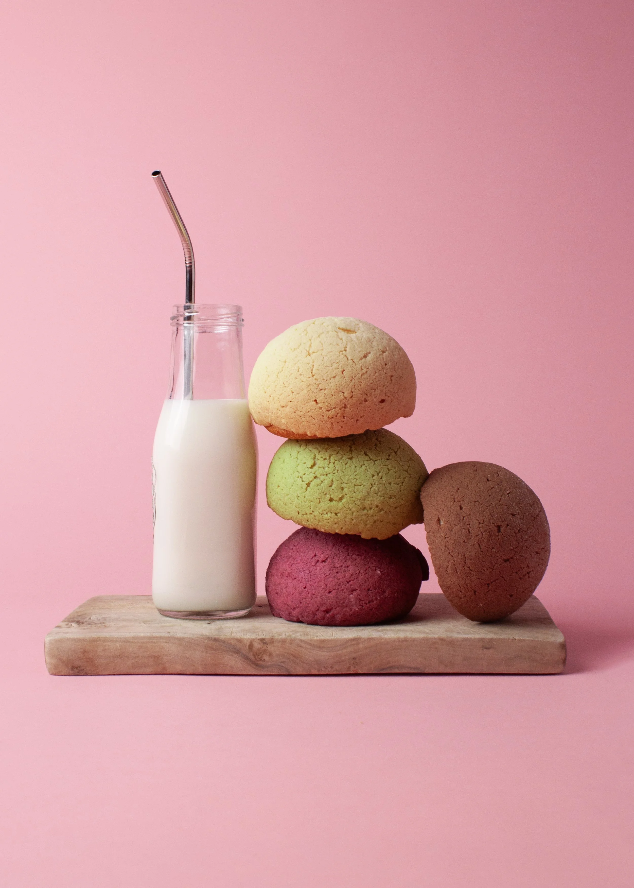
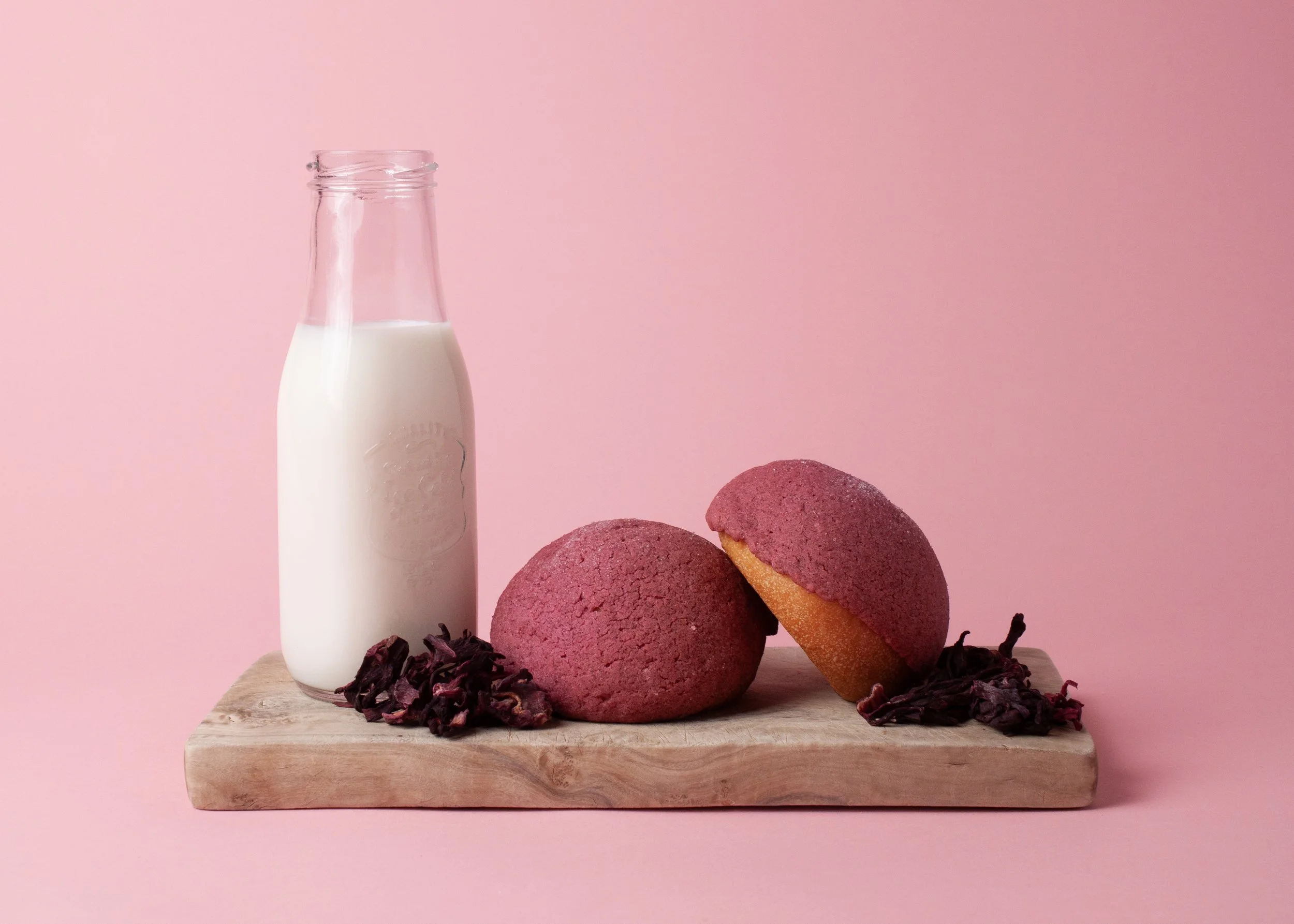
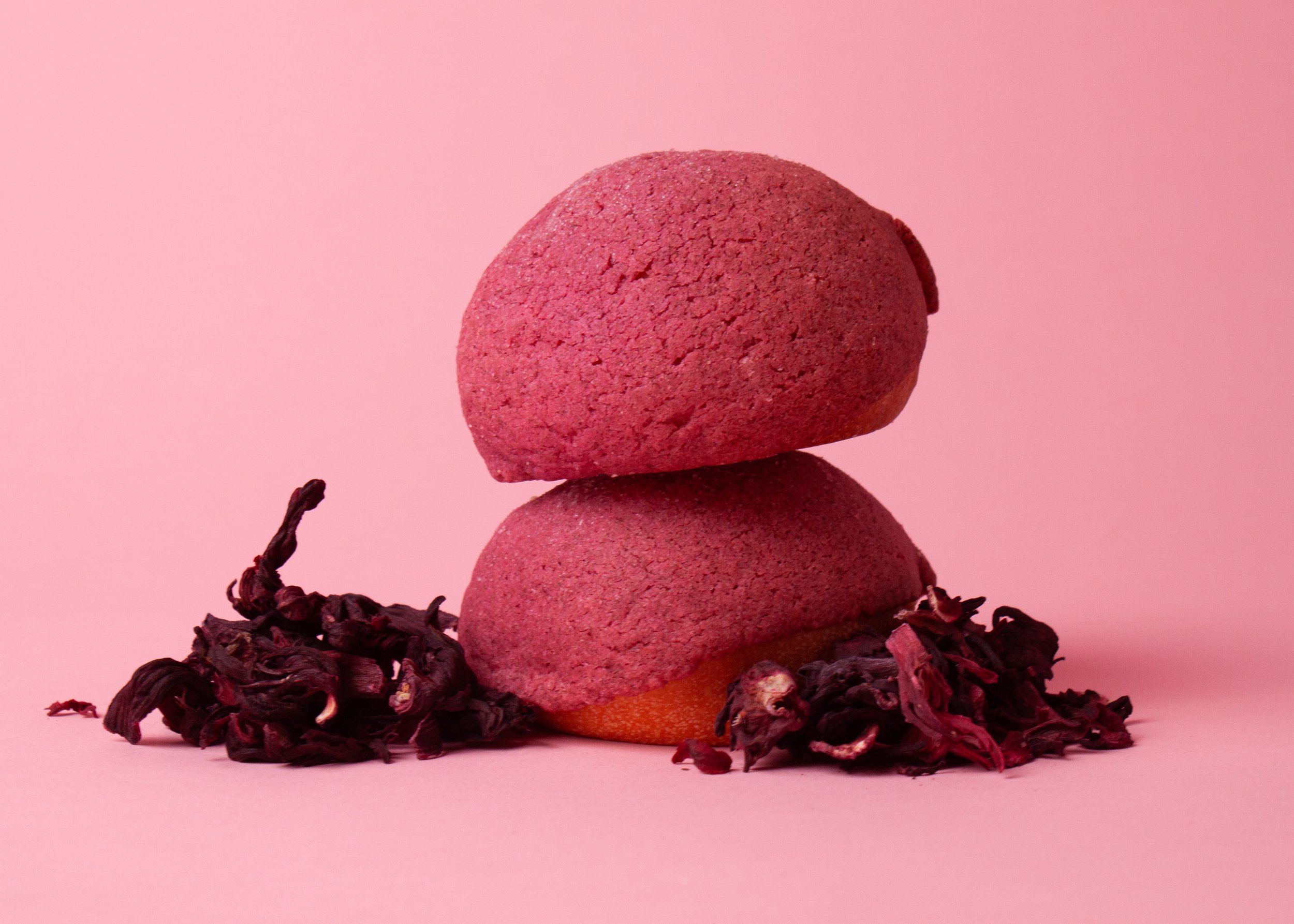
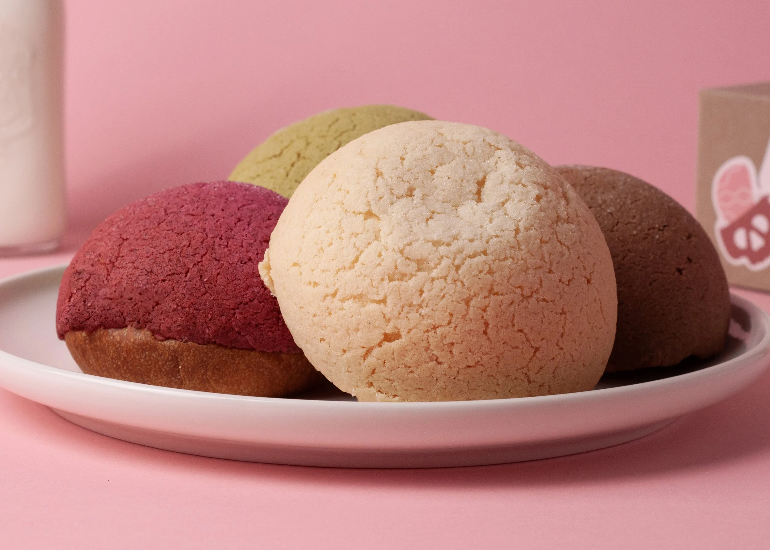
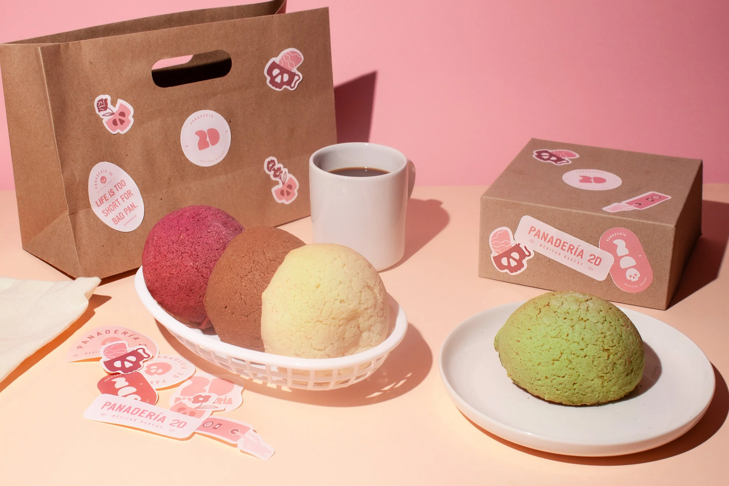
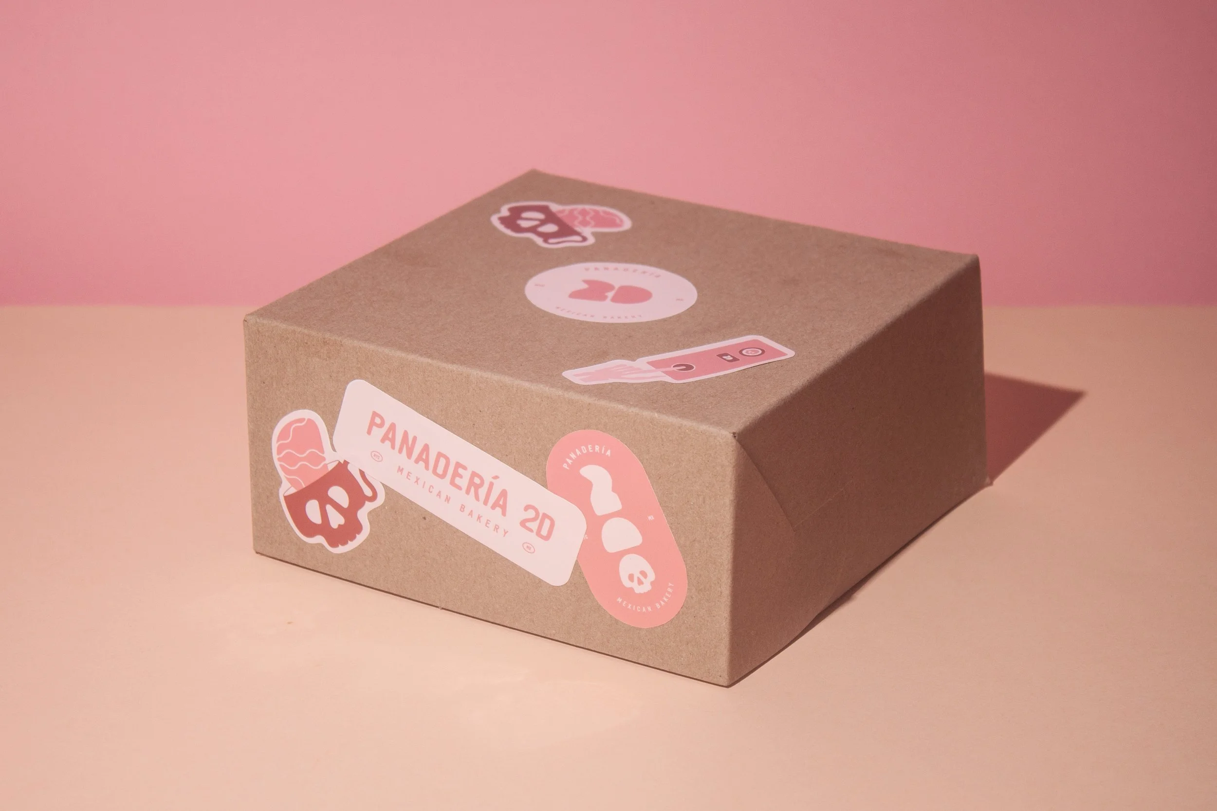
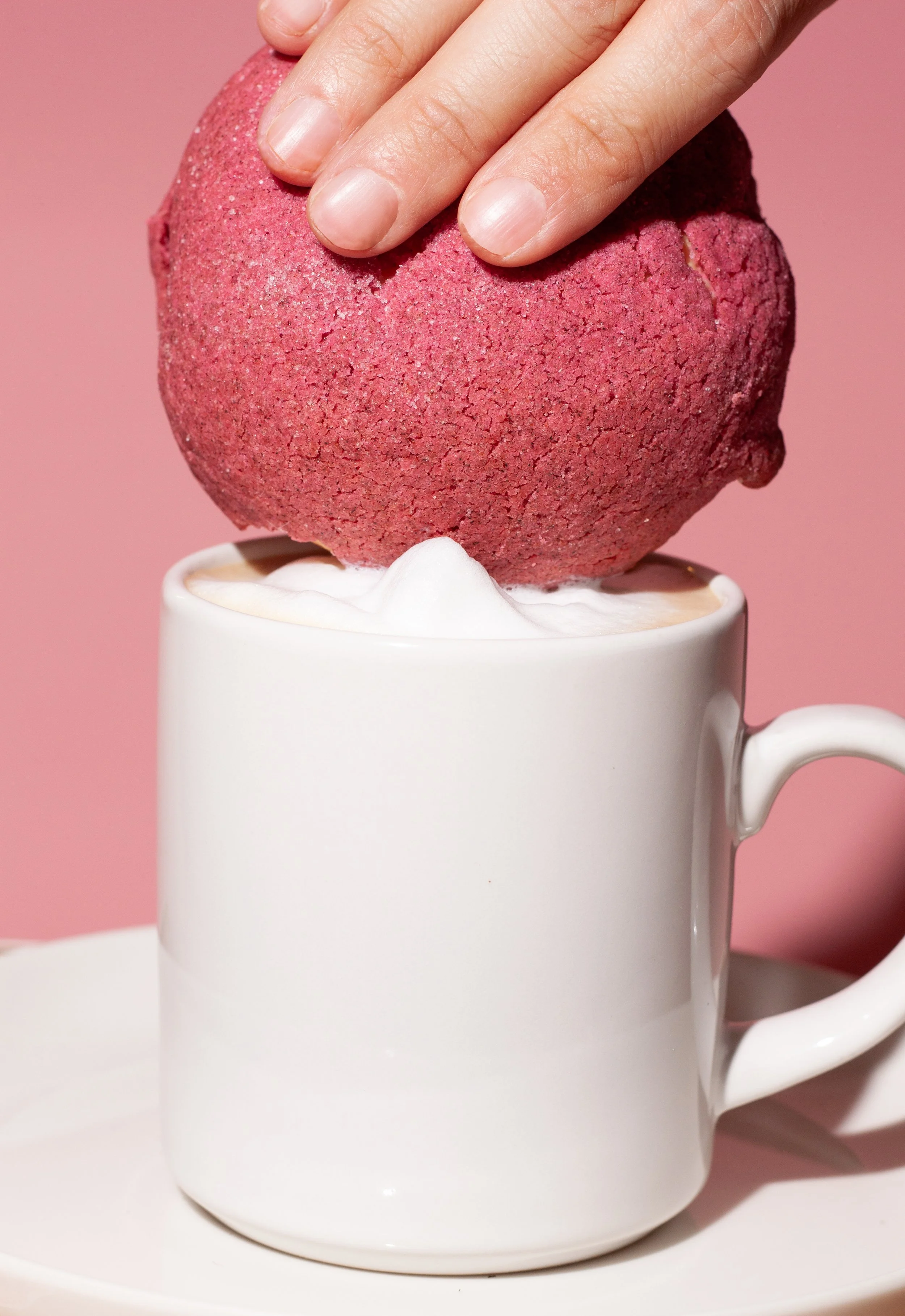
With the visual identity in place, the next step was figuring out how to bring it to life through photography. I wanted the images to feel just as playful and full of personality as the brand itself.
Before the photoshoot, I put together a moodboard with visual references to help define the direction and figure out what I wanted to photograph. I used it to plan the compositions, styling, lighting, and overall feel of the images.
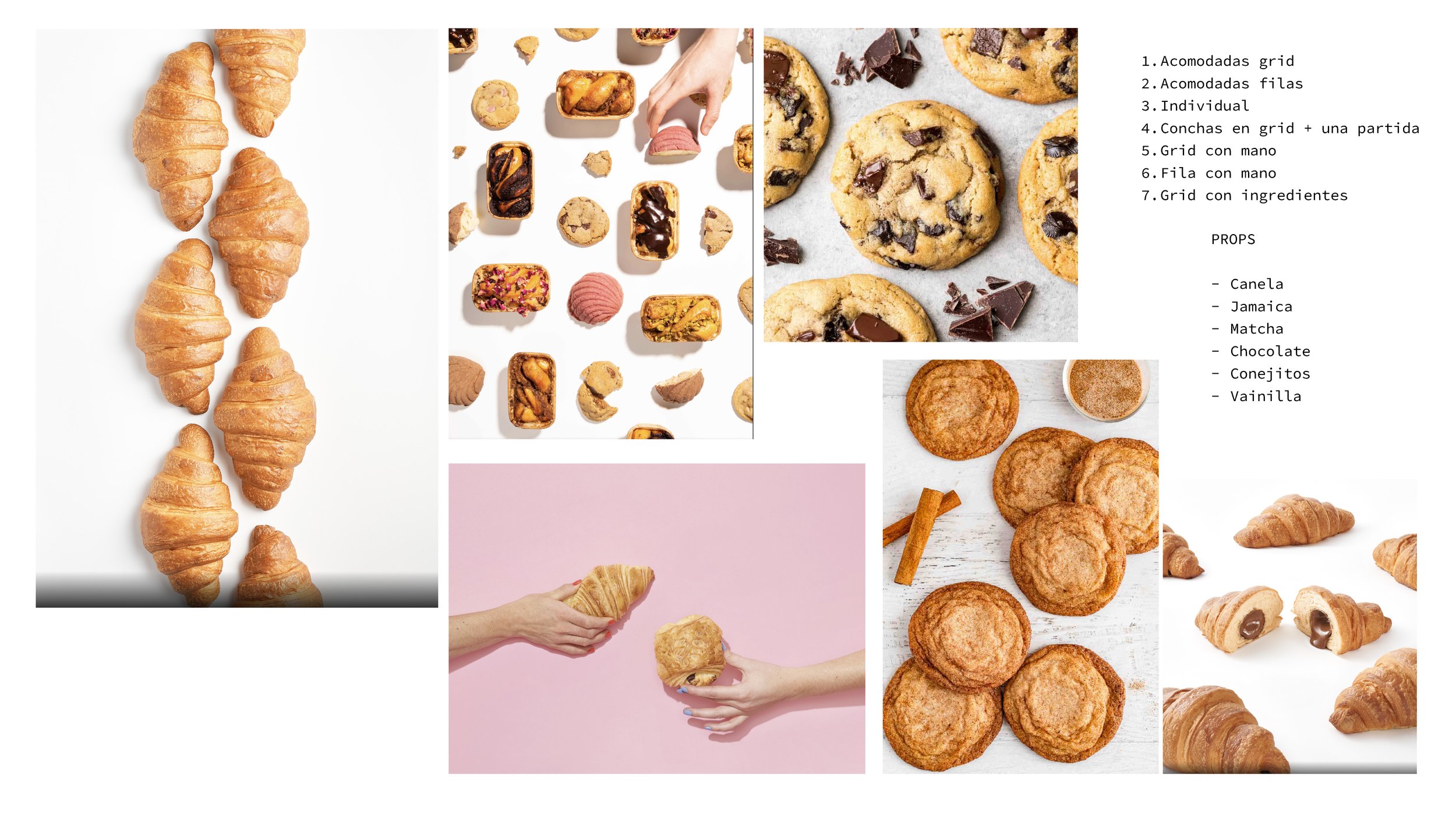
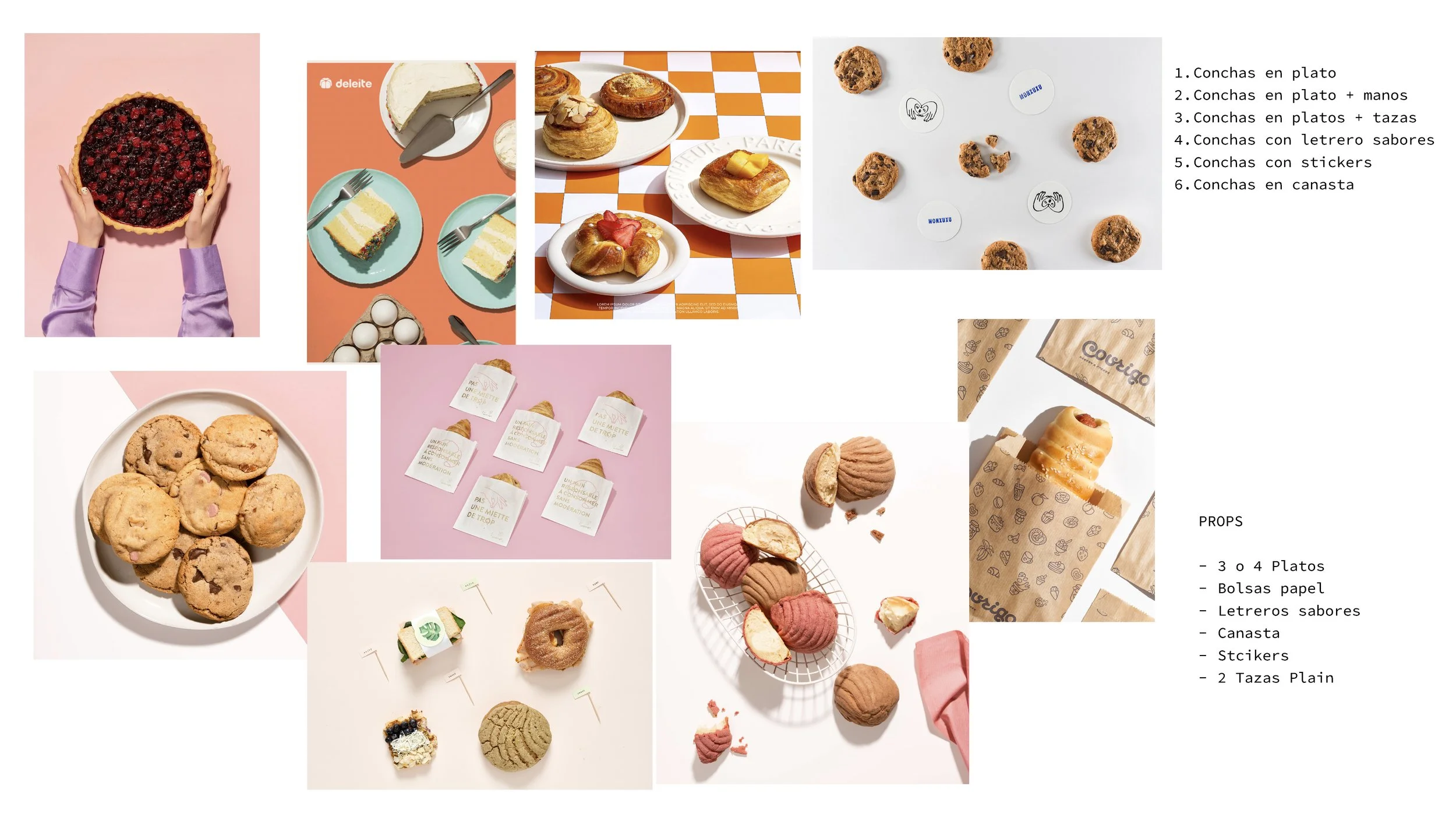
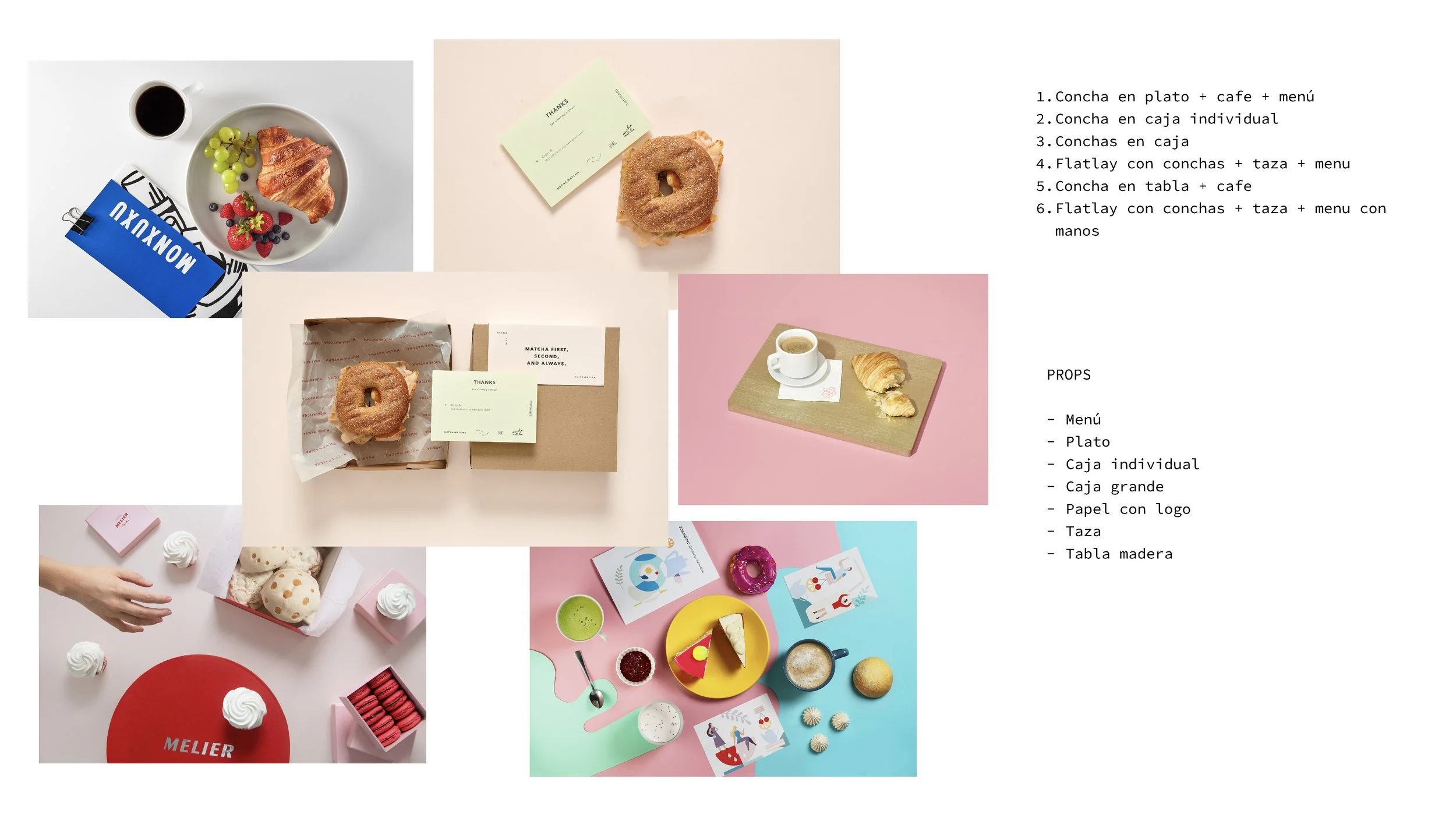
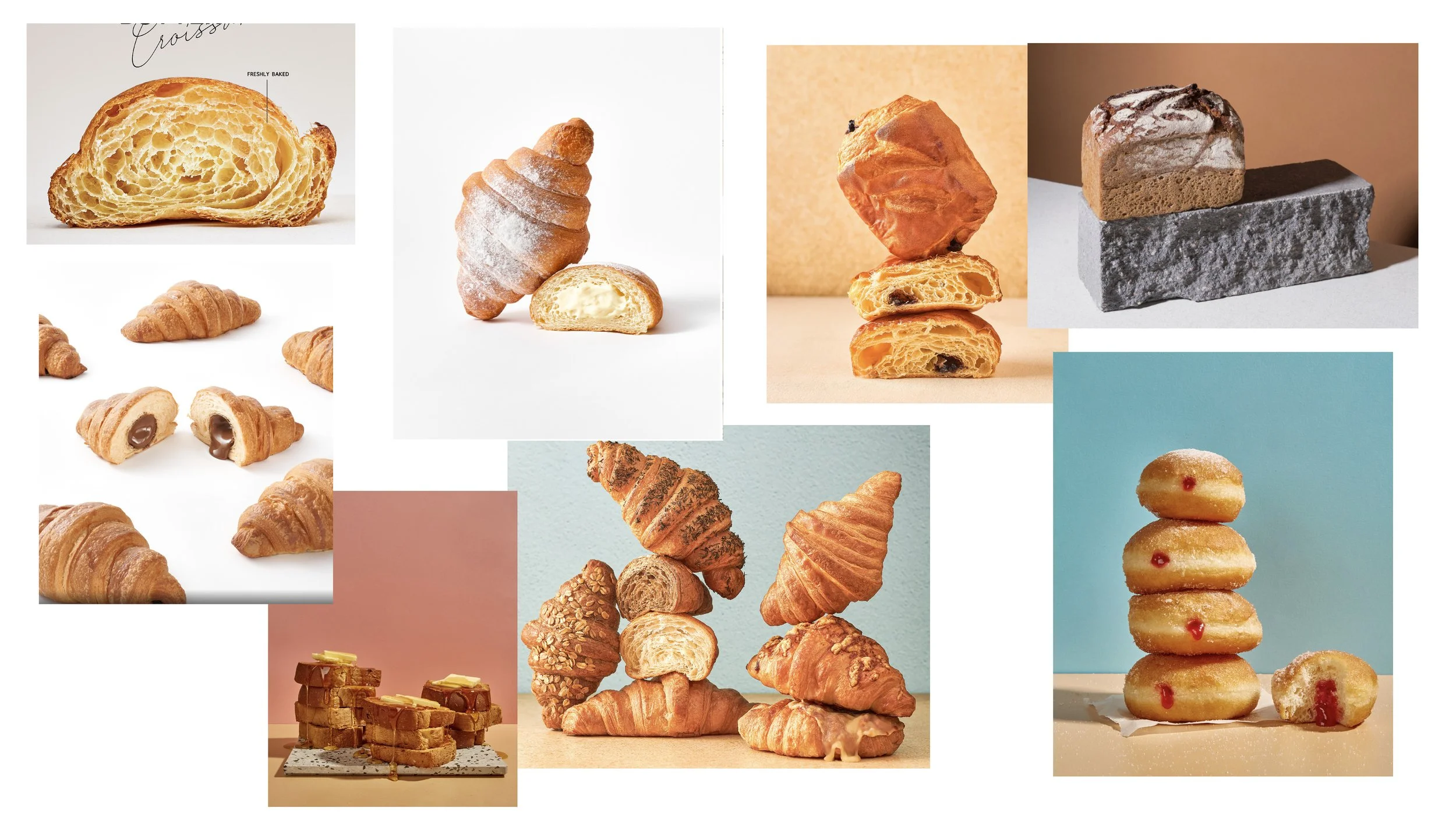
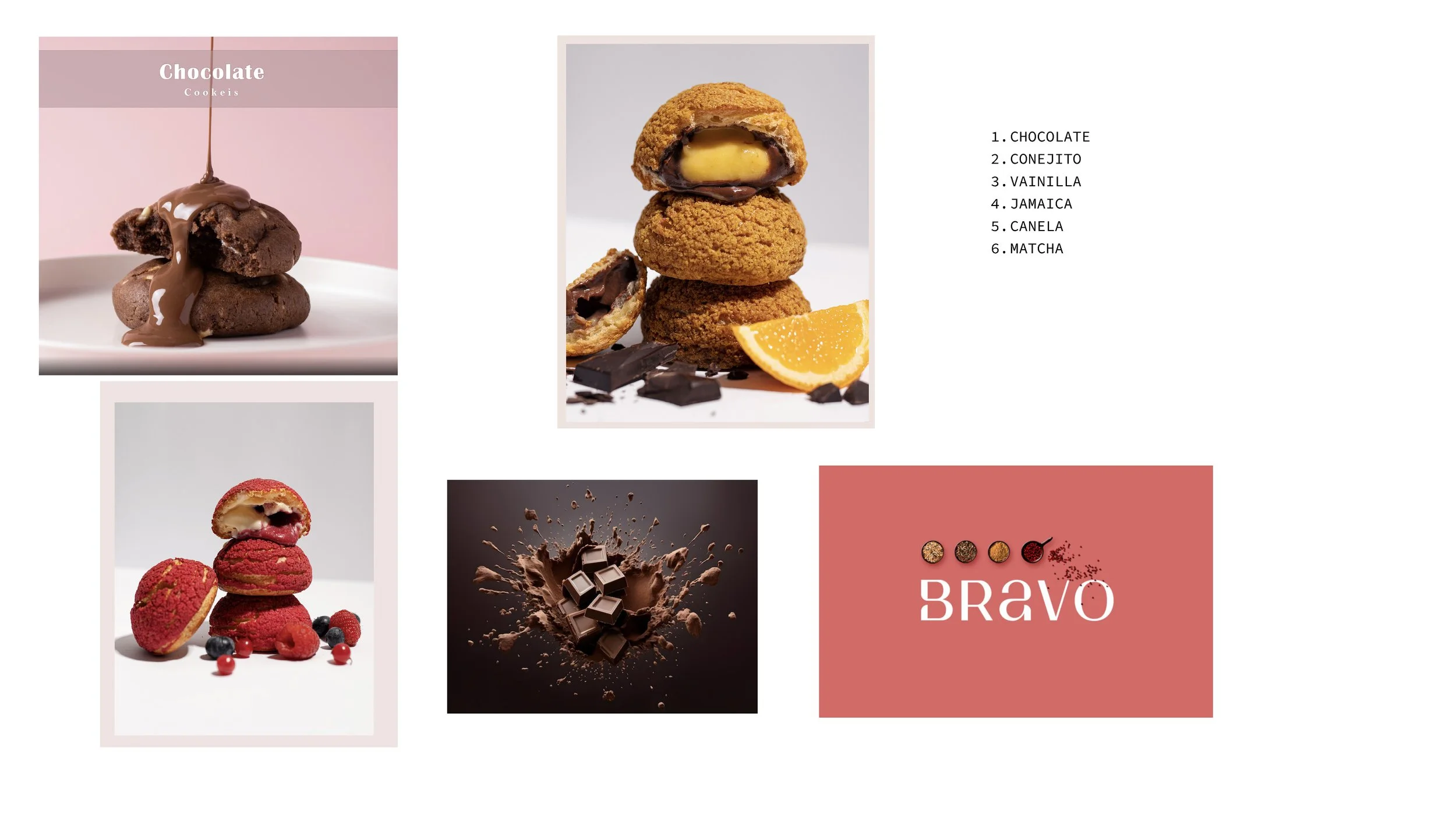
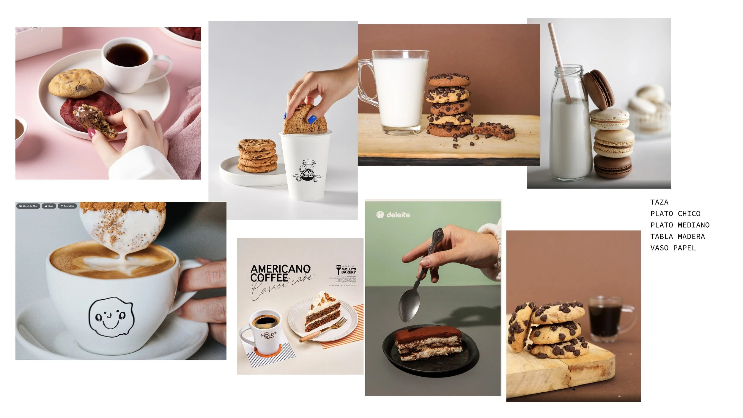
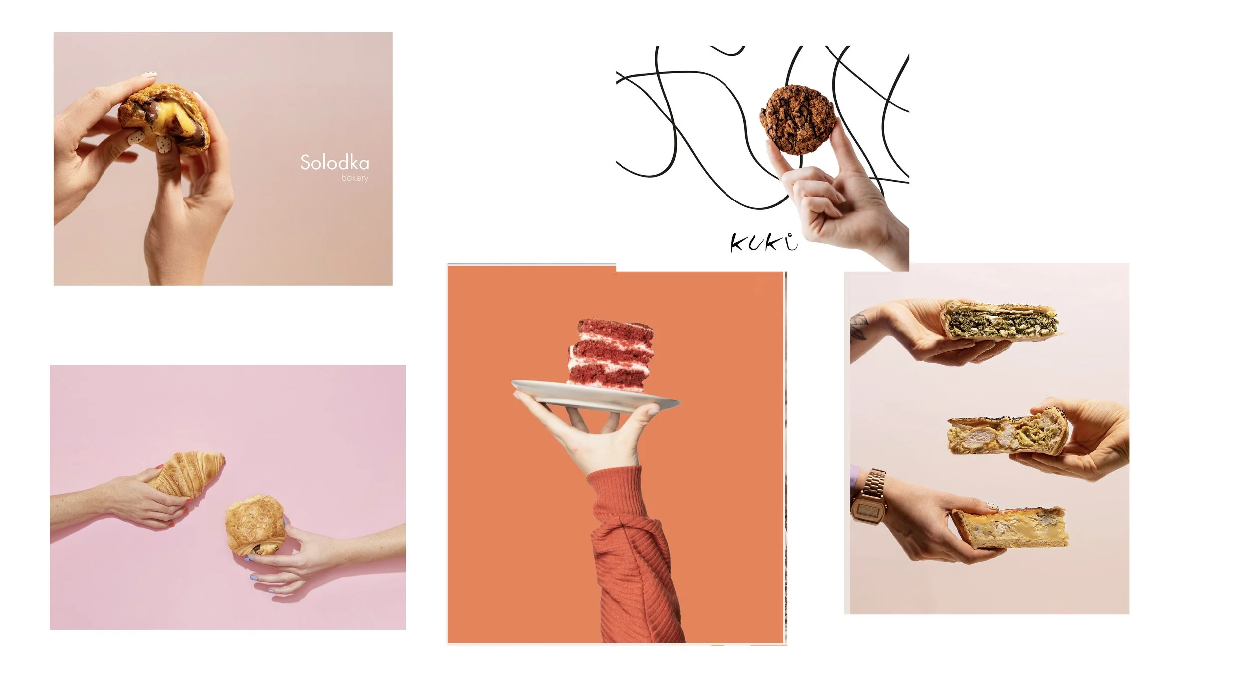
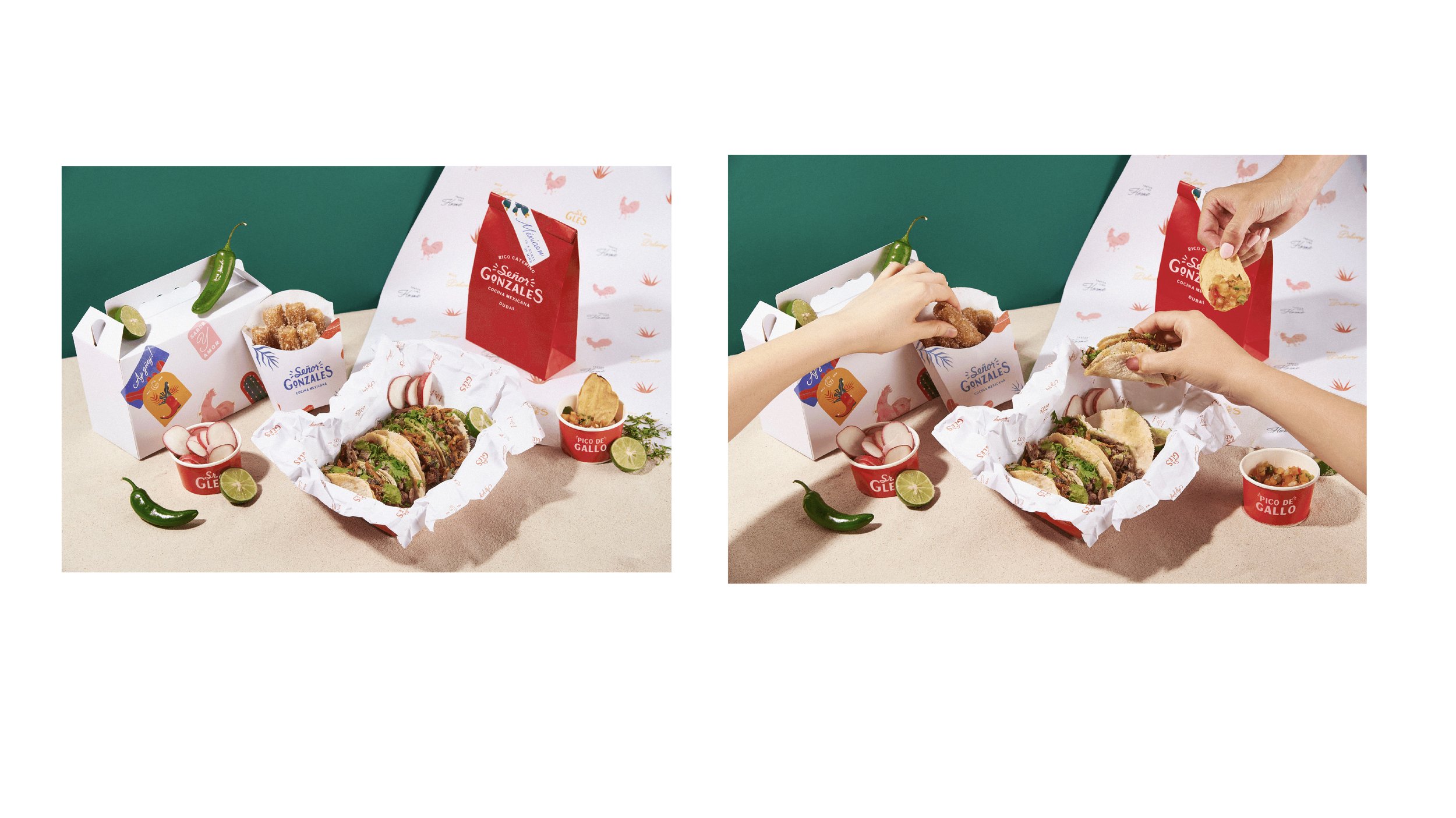
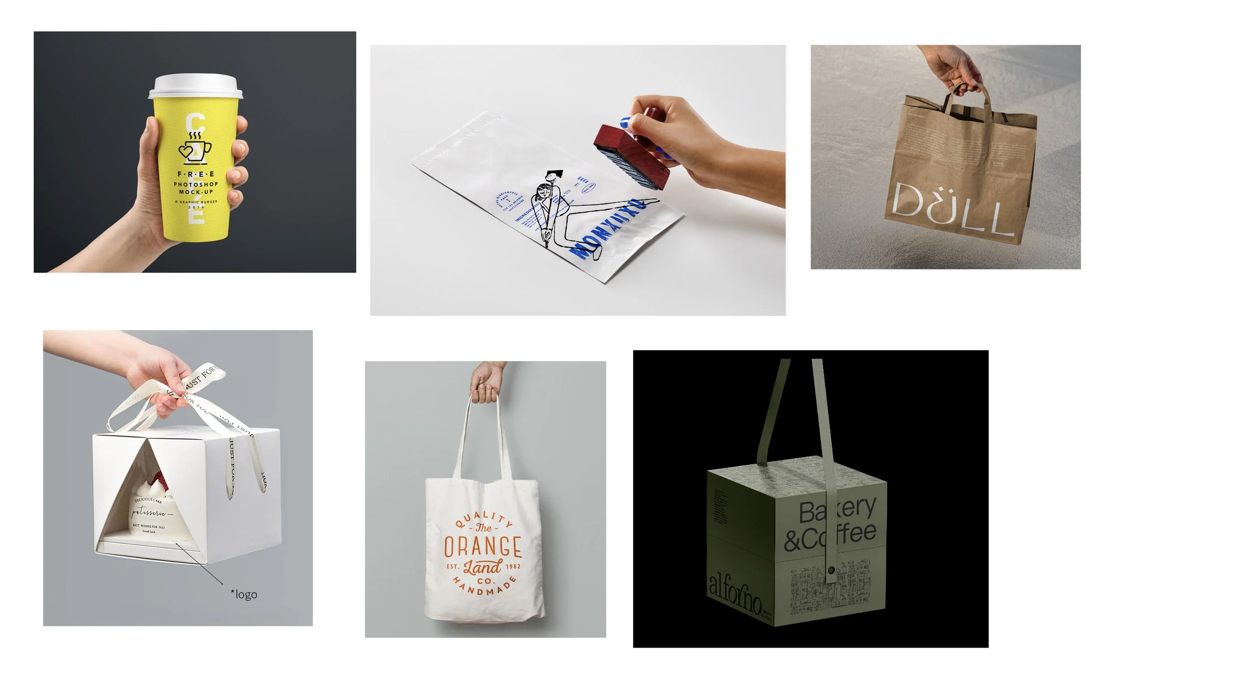
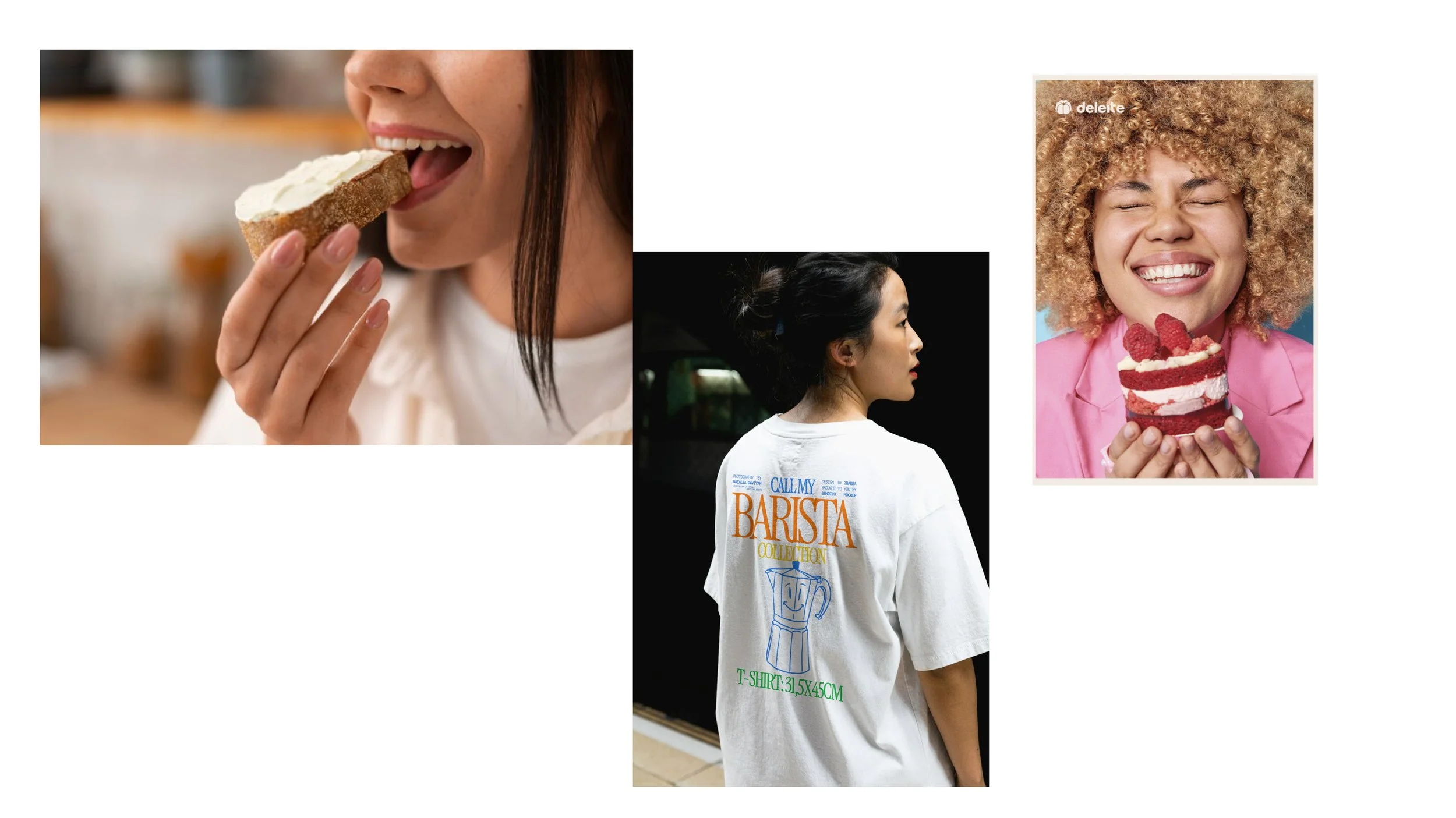
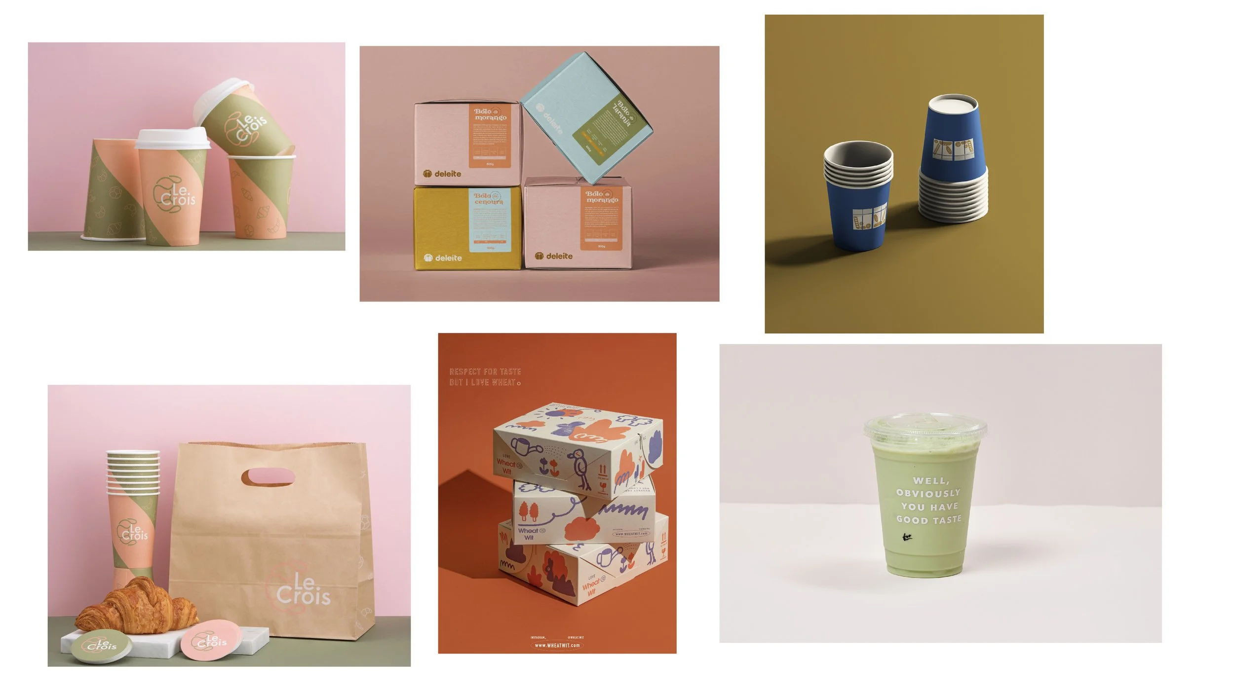
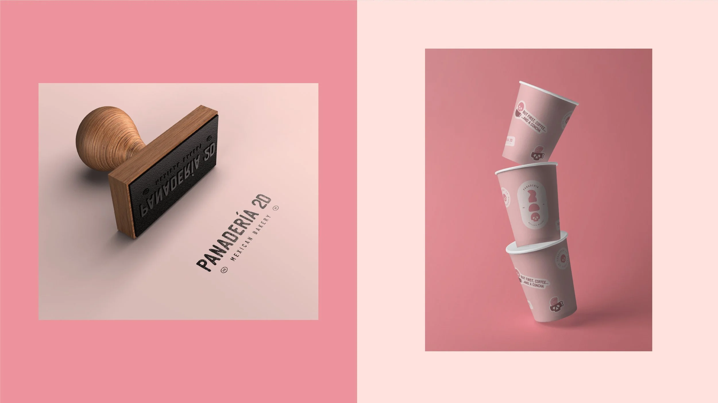
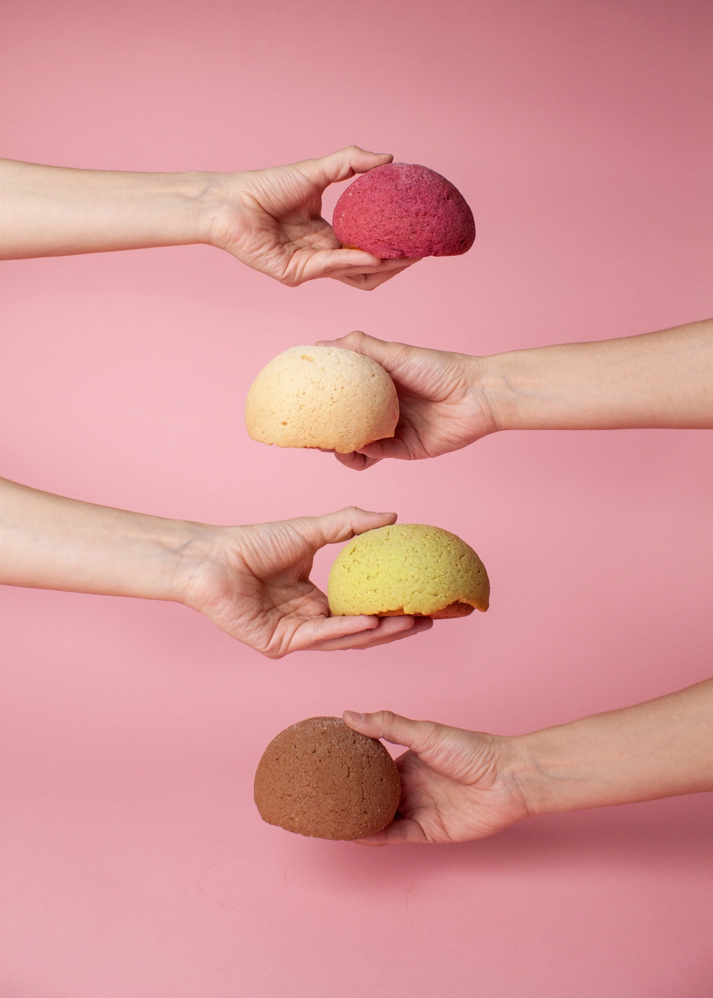
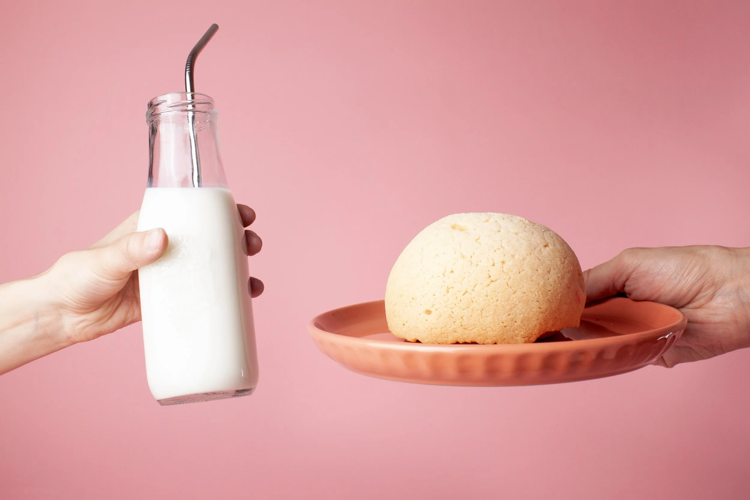
Then I took on the photoshoot and created the mockups myself. I'm not a photographer, but I had a camera, some lighting, and a lot of trial and error. I experimented with different setups and compositions until I had a collection of visuals that felt cohesive and true to the personality of the bakery.
07 / RESULTS
The final identity brings all the pieces together: a flexible logo system, custom typography, a playful color palette, illustrations, and motion. Designed to work across different touchpoints, the brand has a consistent look and feel while leaving room to adapt across packaging, signage, print, and digital.